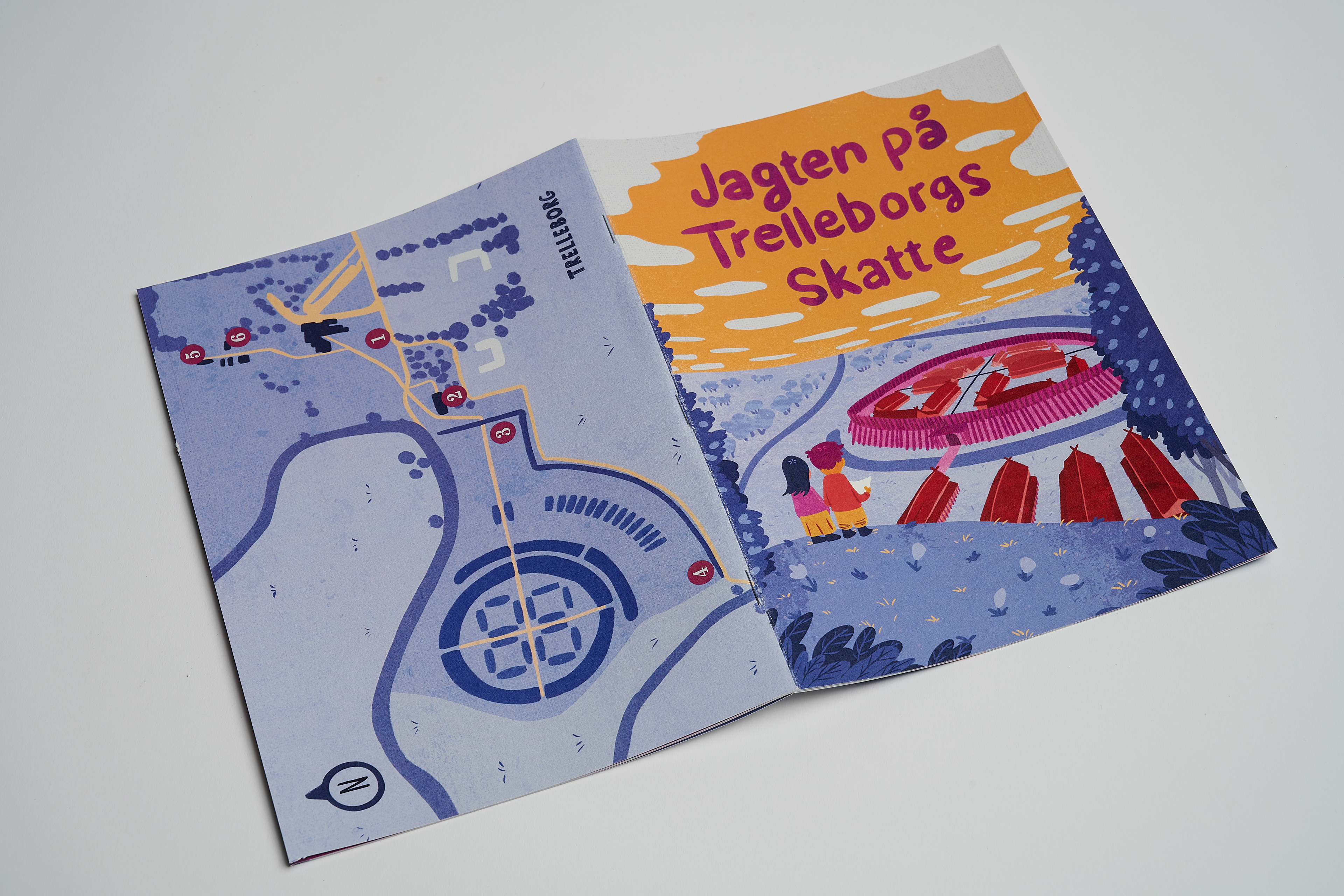
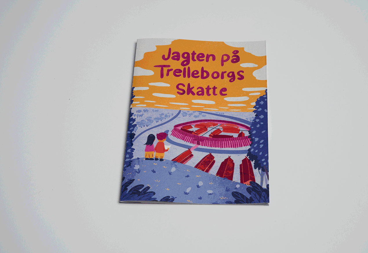
Trelleborg Museum Brochure game
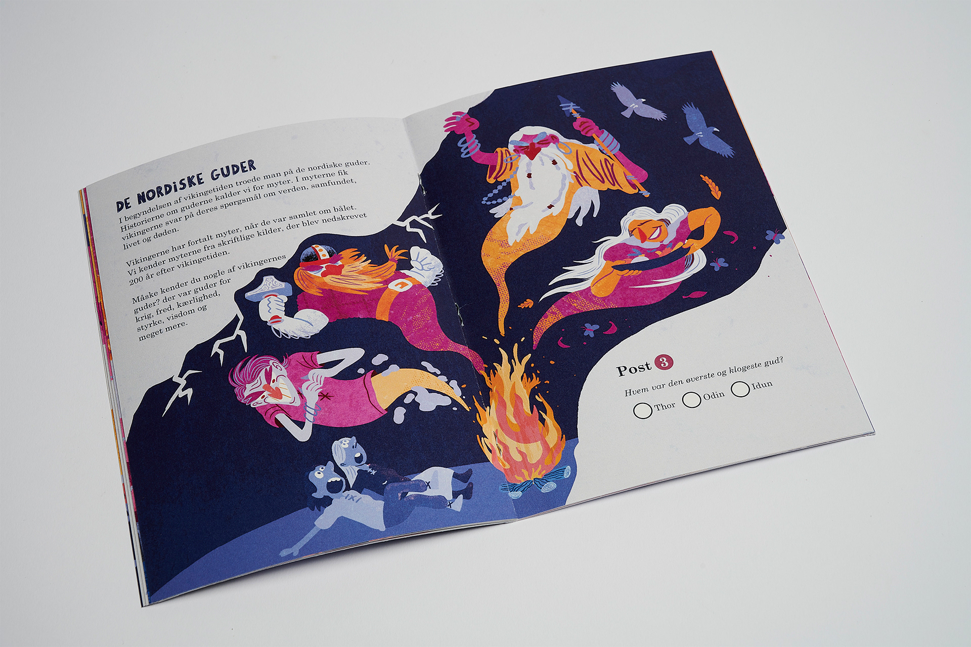
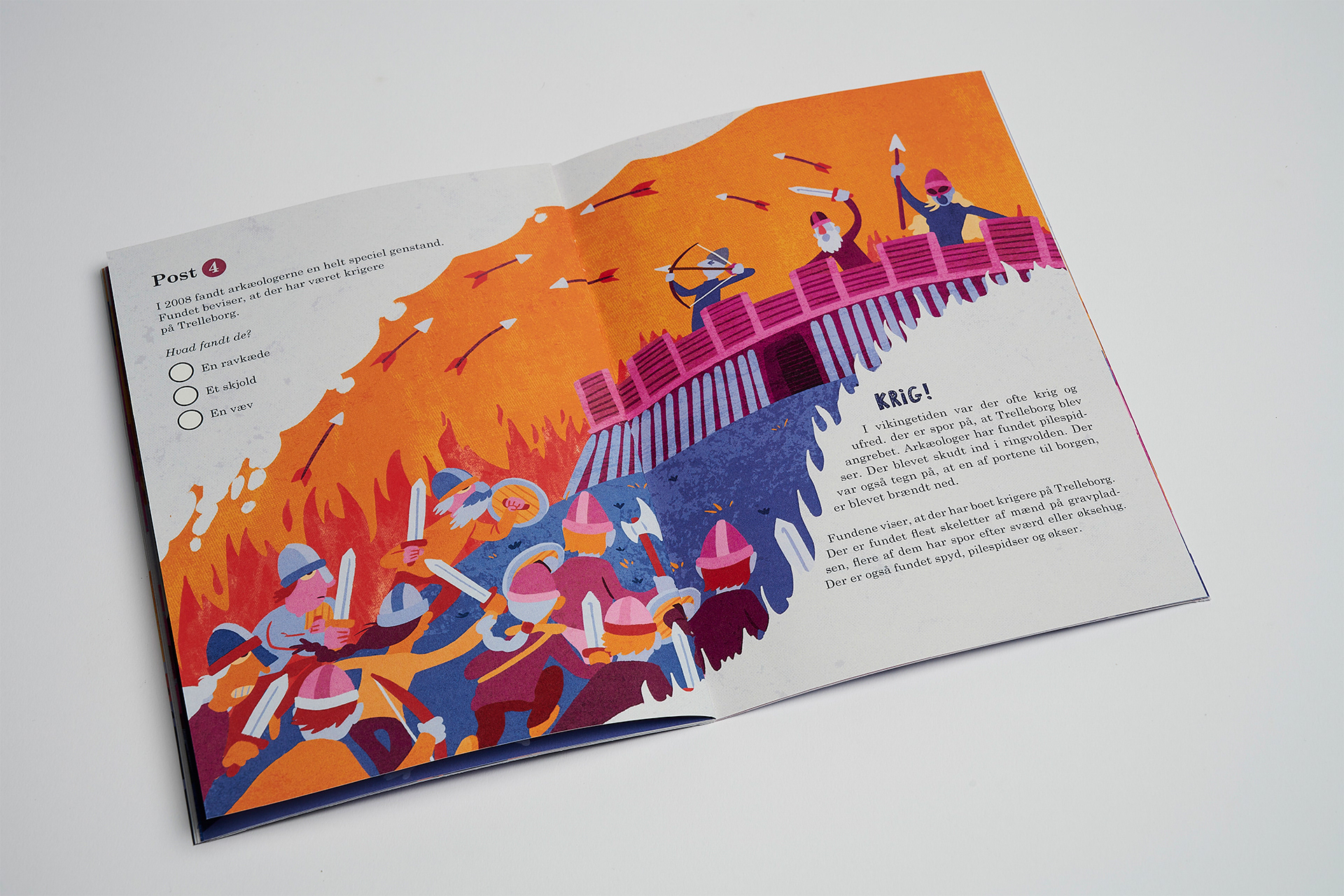
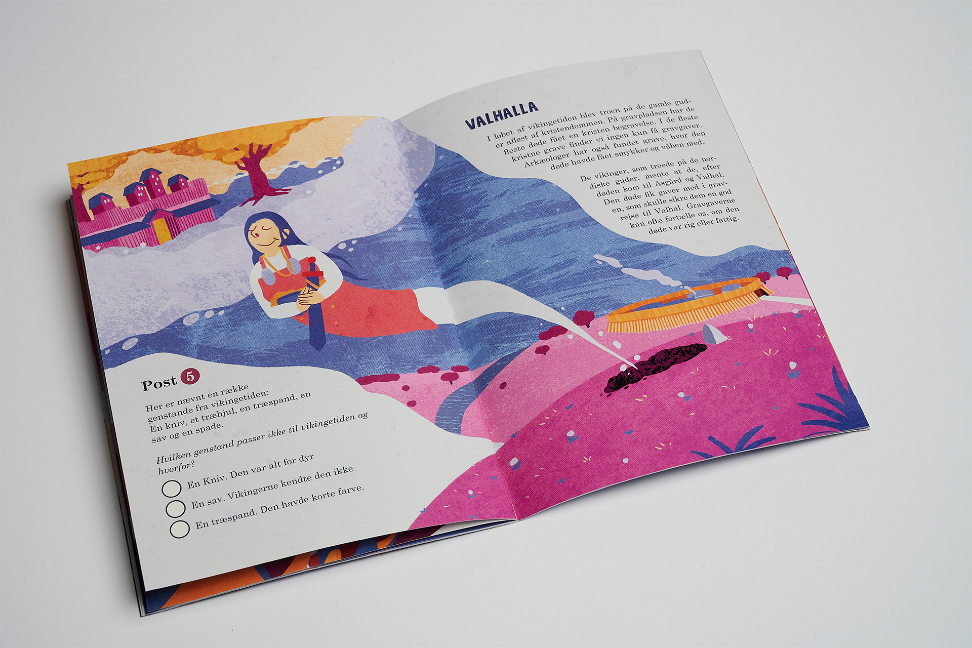
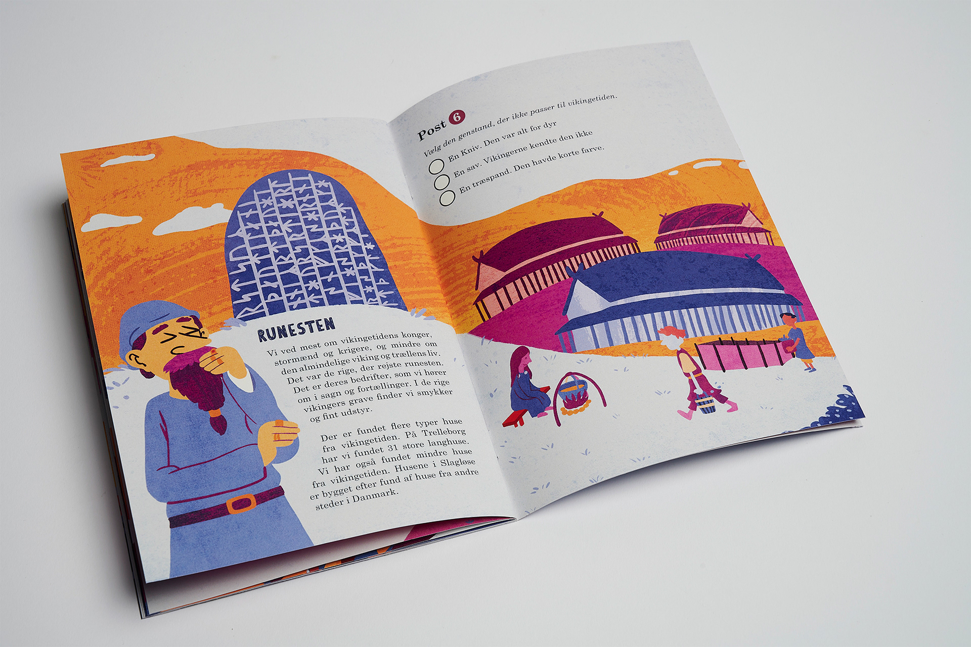
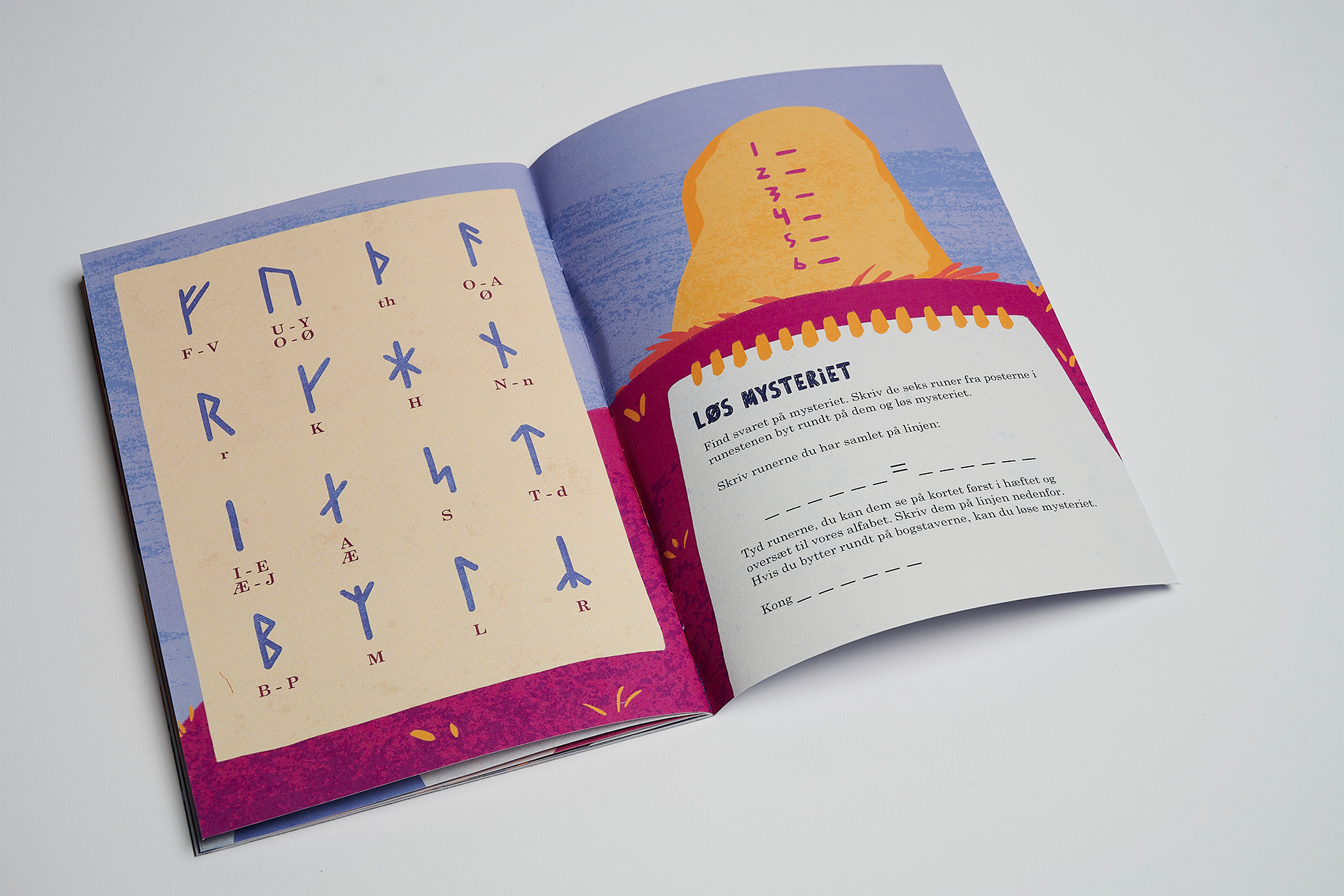
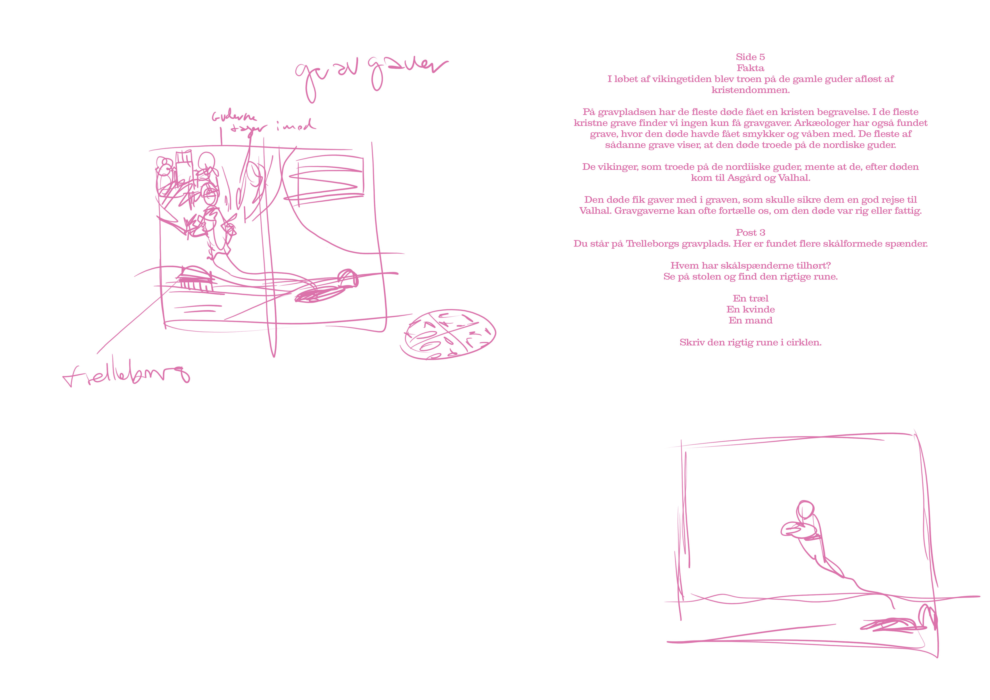
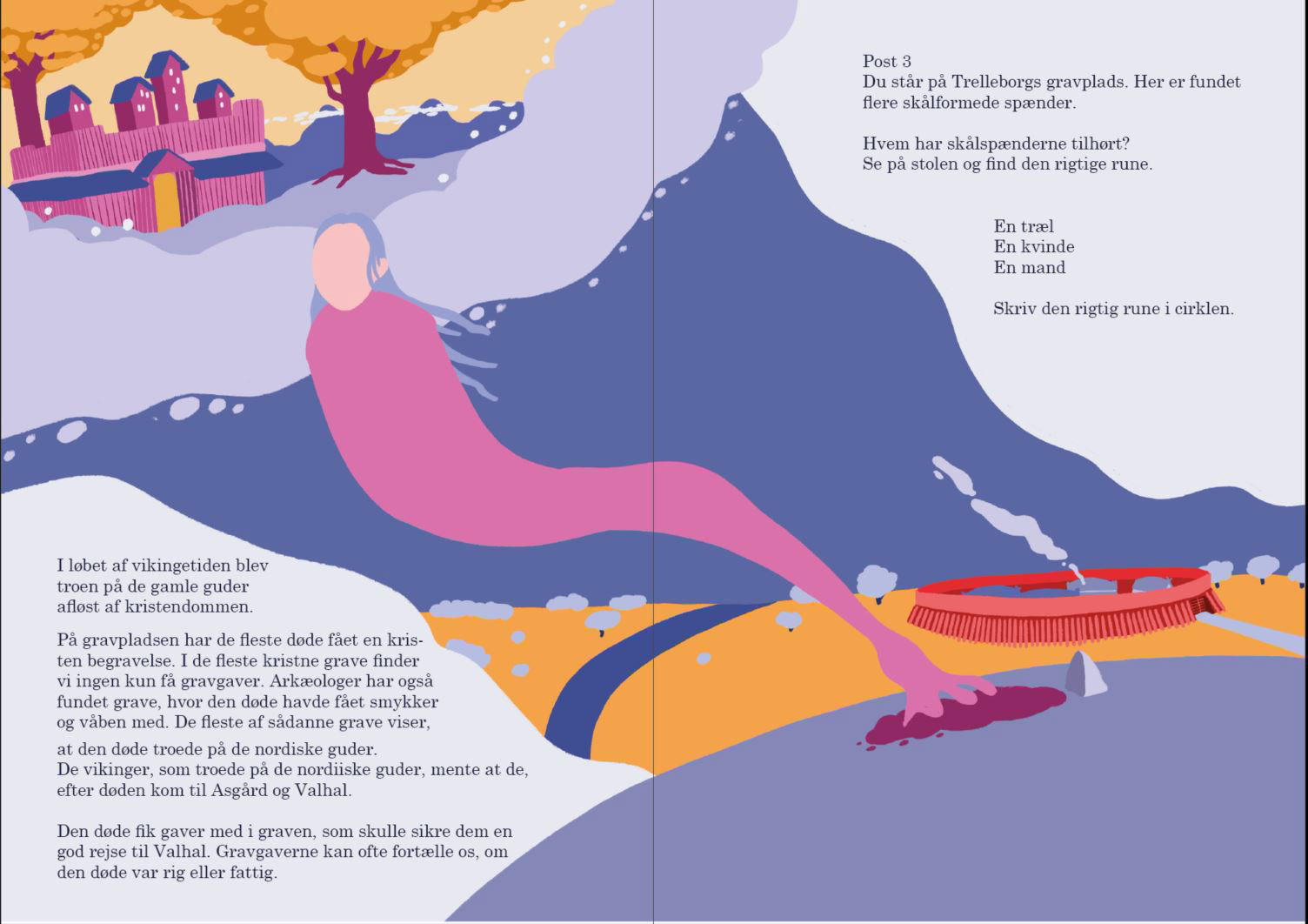
As part of my 4. semester project I made a brochure for the viking museum Trelleborg. The brochure was created to give children visiting the viking fortress an exciting experience and an alternative look into the lives of the vikings at Trelleborg. The brochure functions as a game where the users go around to different stops at the site, while keeping track of the narrative in the brochure. Inspired by children's books and visual composition of guiding the reader through an illustration, I made a visual identity that stands out from the normal depiction of vikings, with vibrant colors and heavy texture based illustrations.
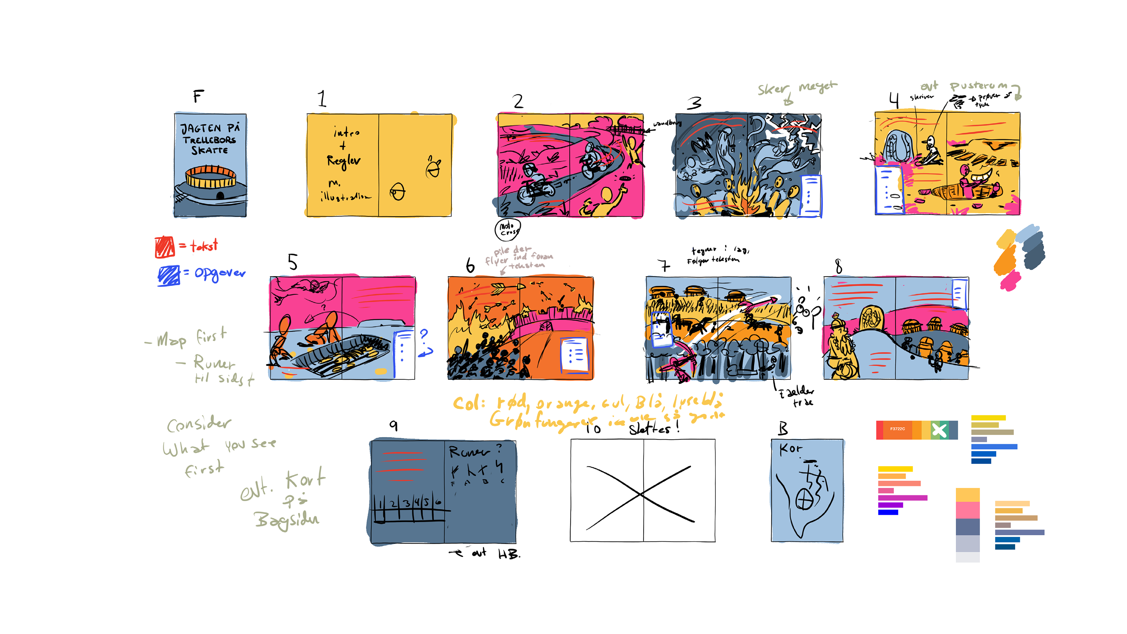
Pages of Illustration
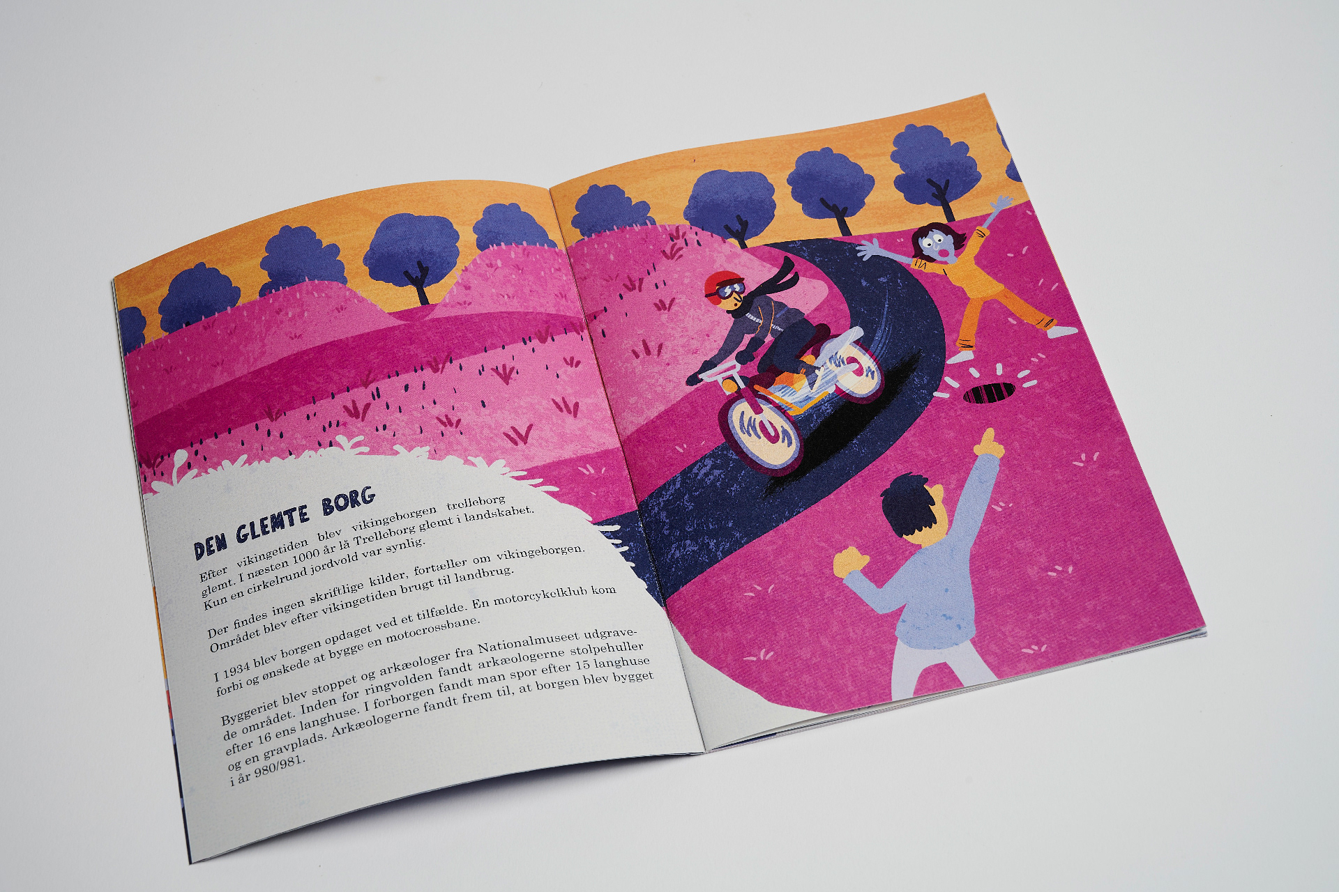
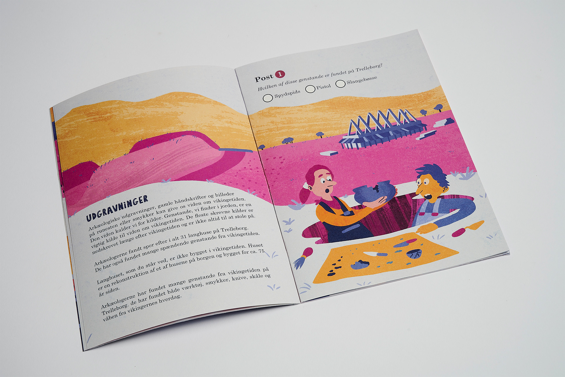
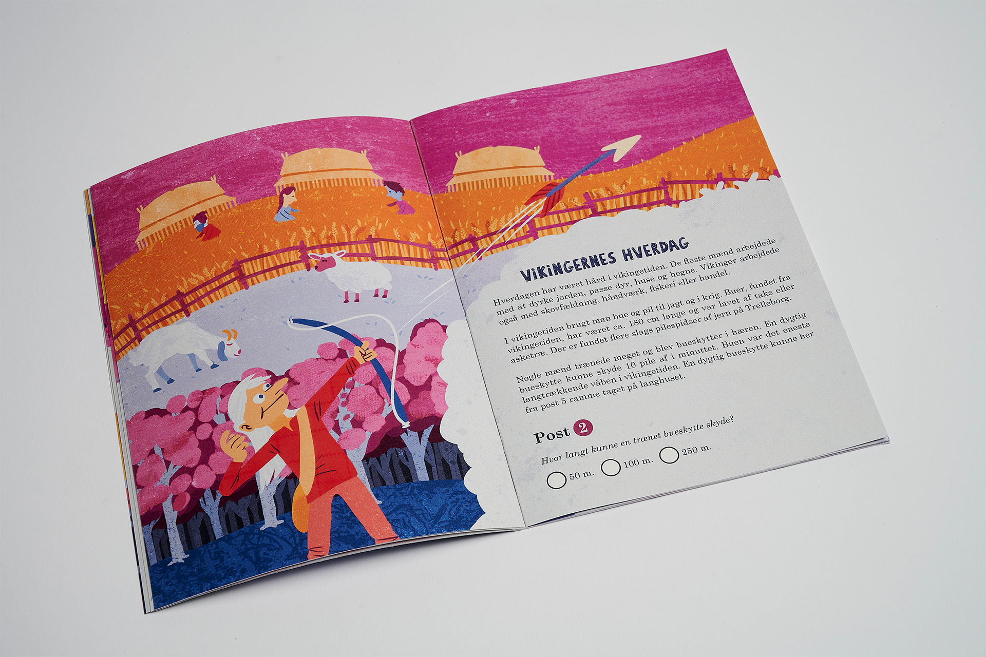
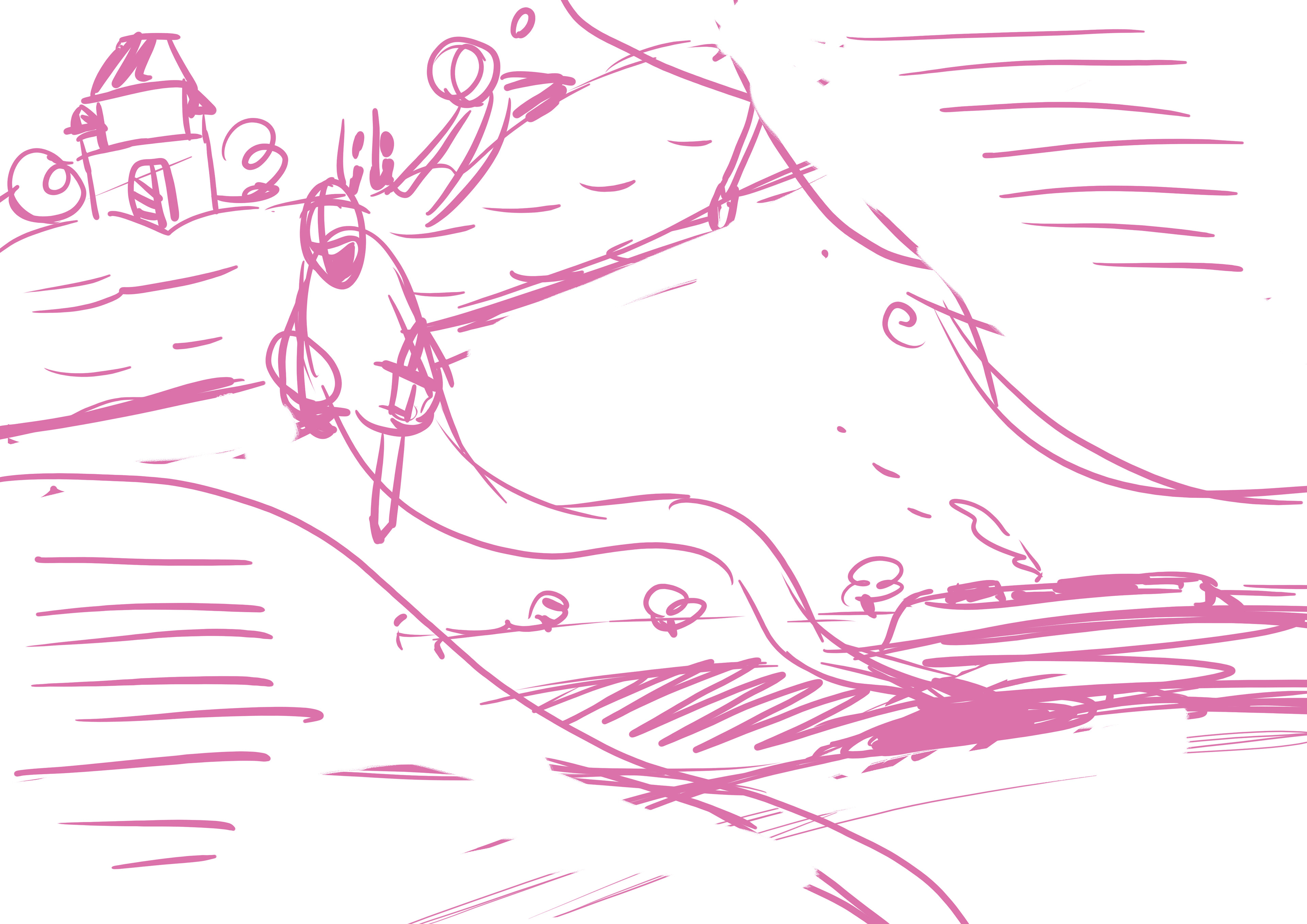
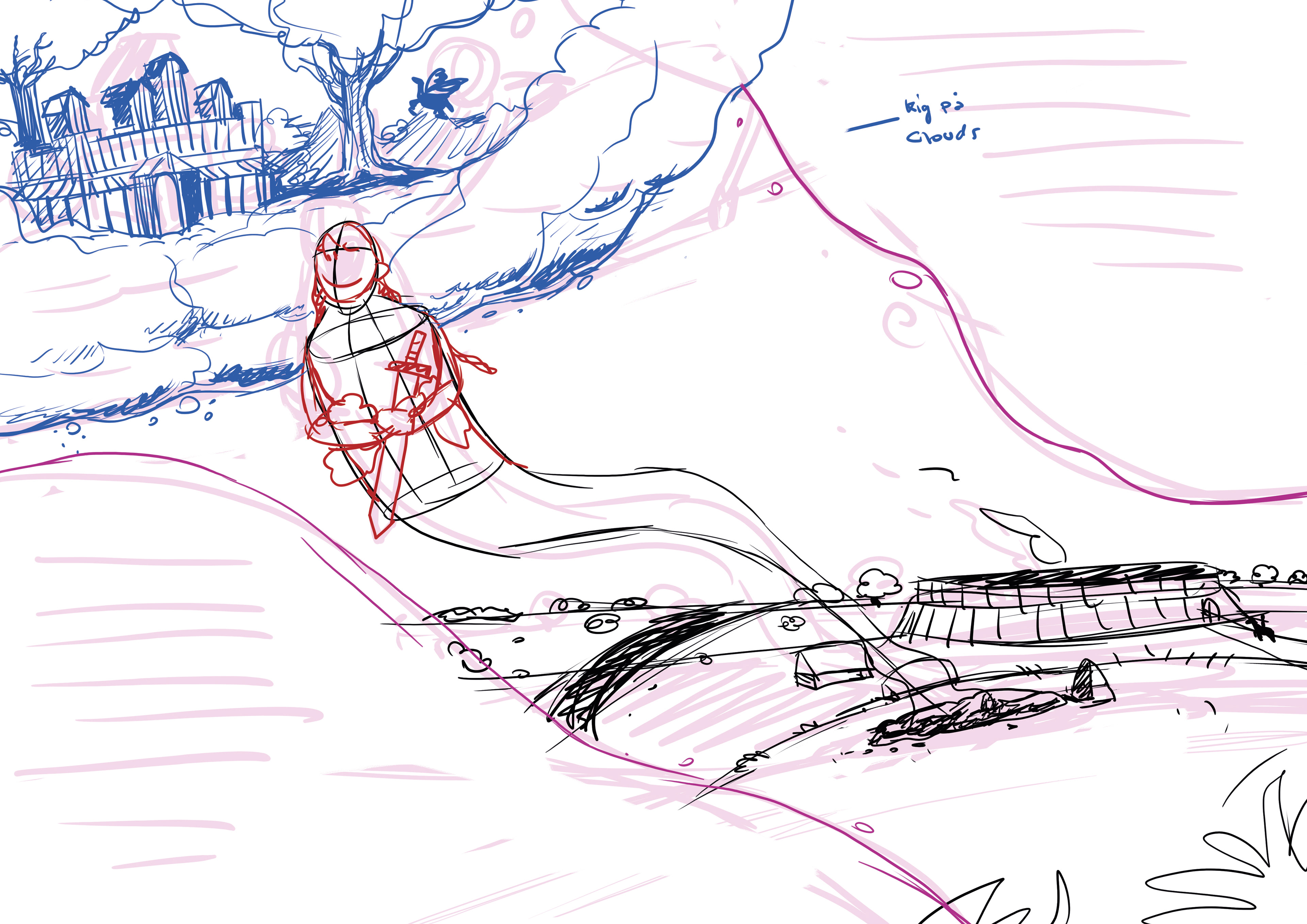
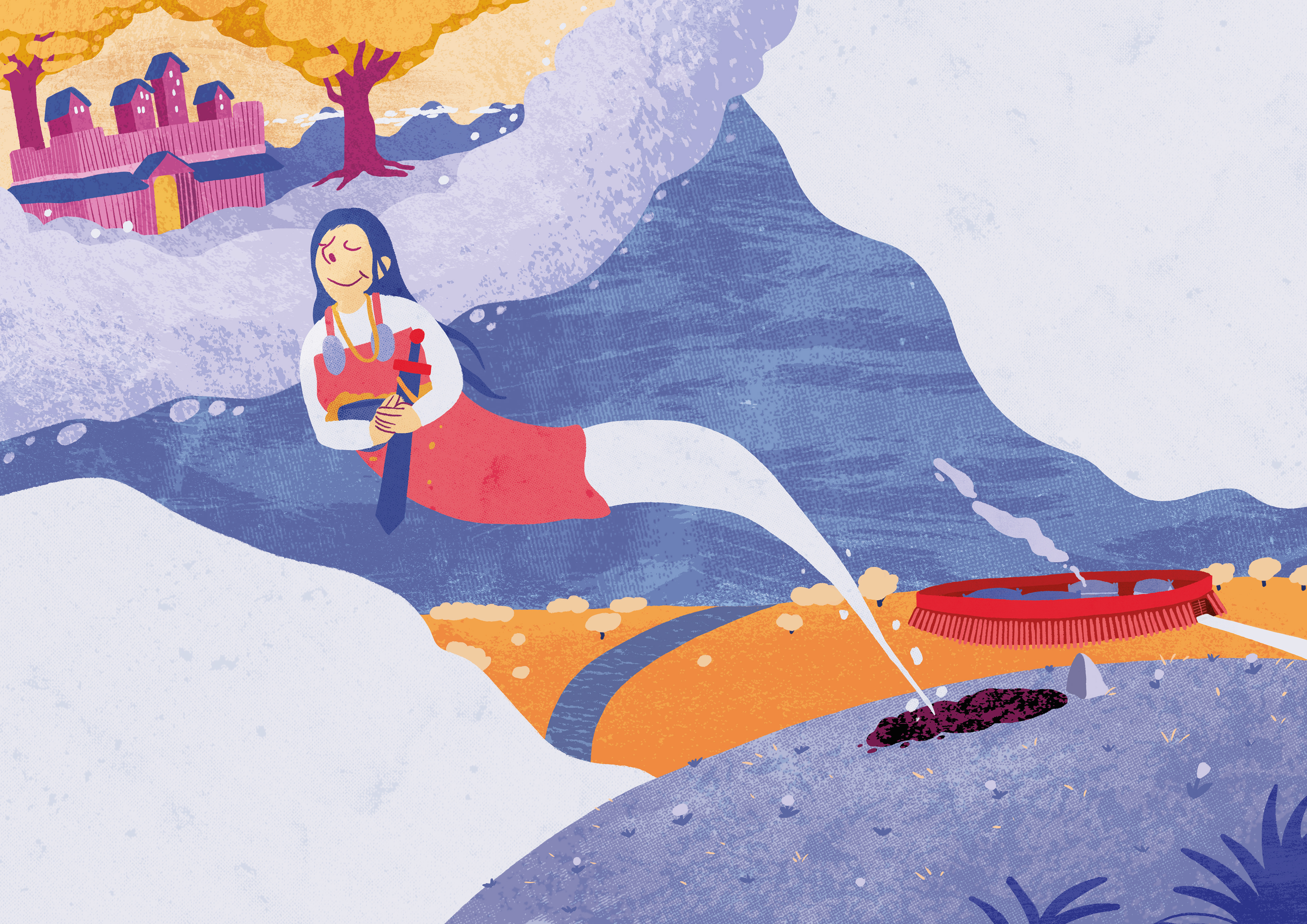
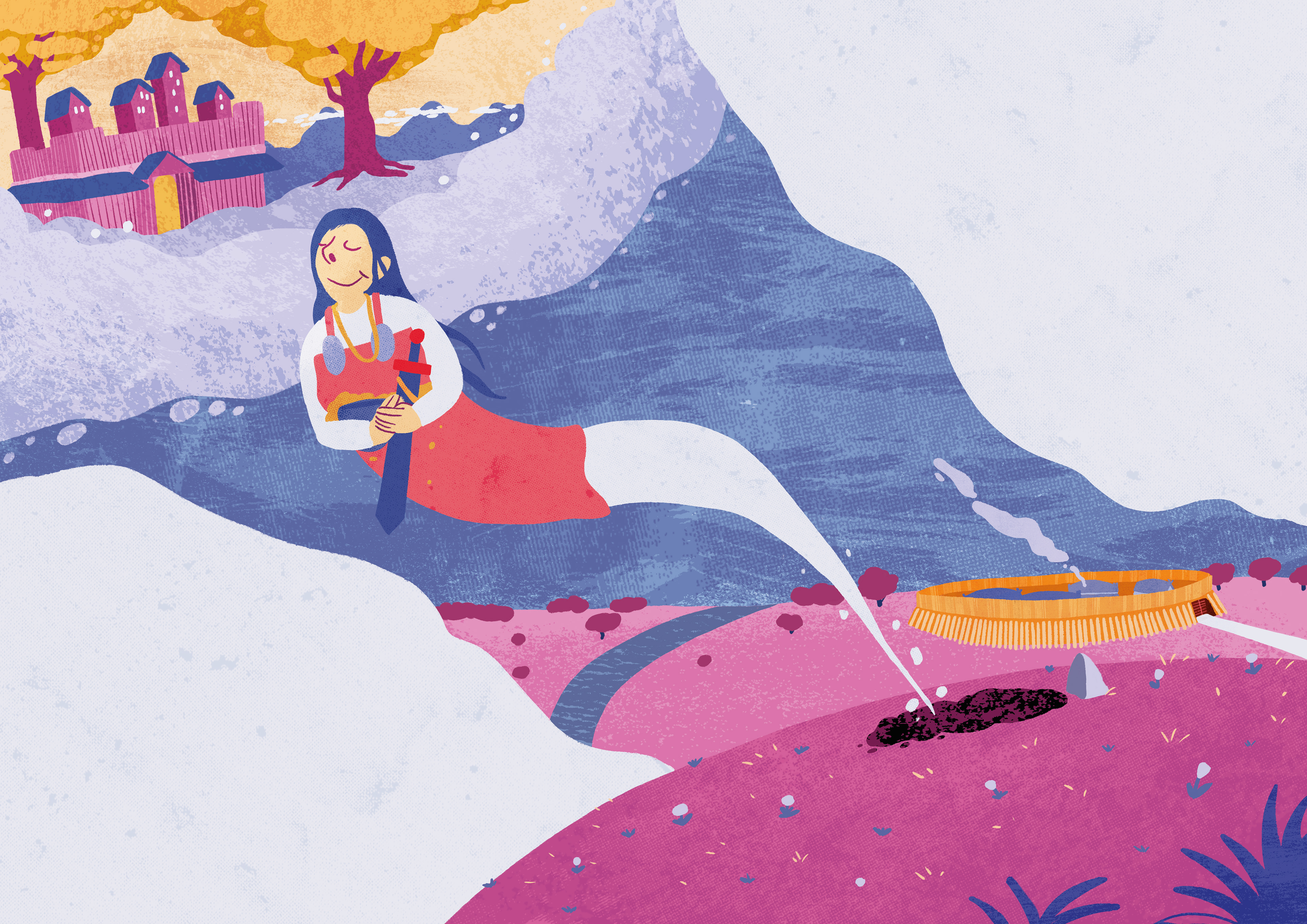
In the brochure it was important to me that the text was not only written out in letters, but that the illustrations showed the content of the text. My goal of each page was to create a flow with both illustration and text. For each page I started out with the thumbnail as reference. I created a rough sketch in the right format, and tried to look how the text could be implemented in the natural flow of the illustration. To give illustrations a more tactile visual feeling, I put a lot of texture into all blocks of colour. Creating this completely different style of illustration from what I was used to in other projects. Here is the process of creating one of the pages.
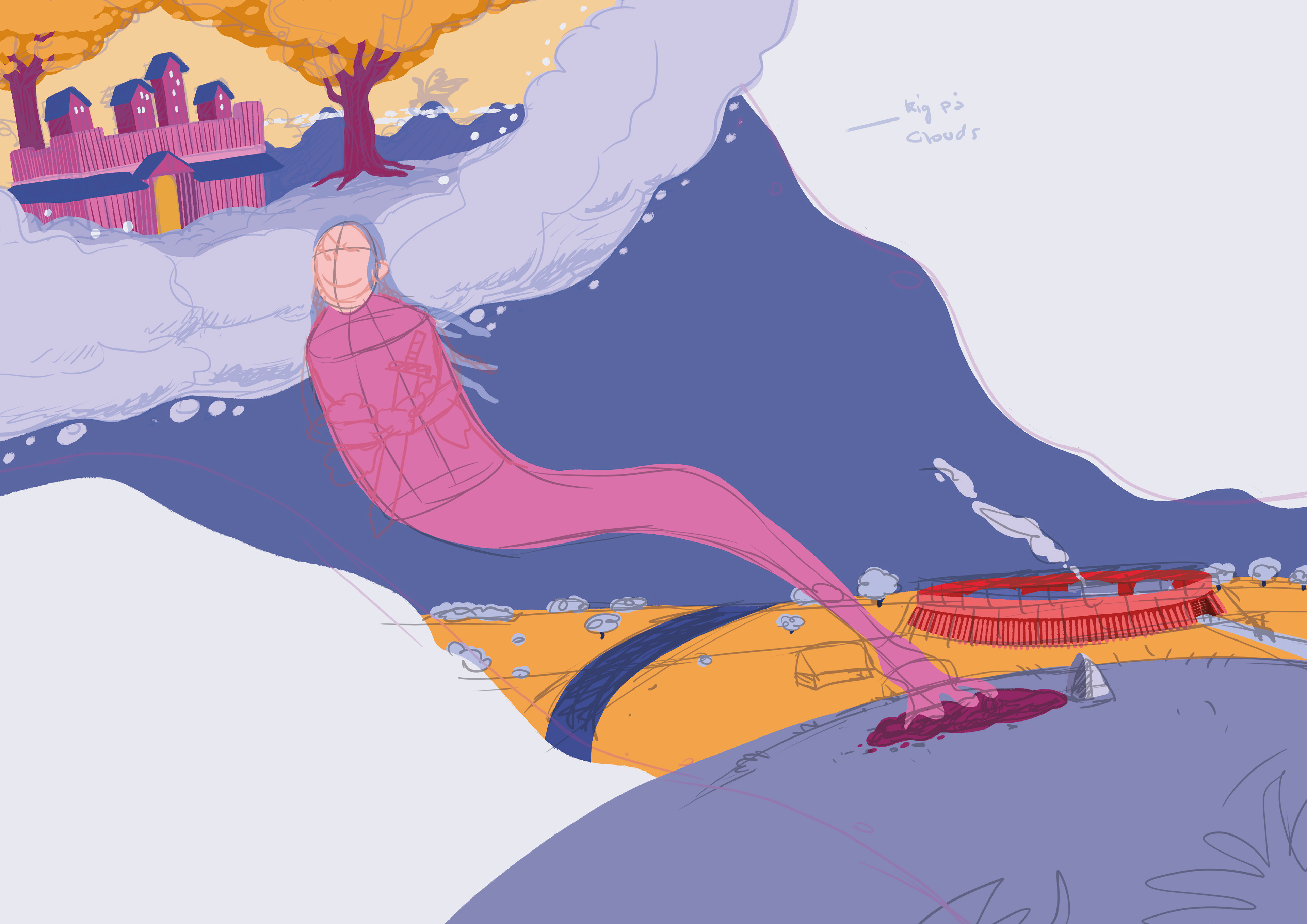
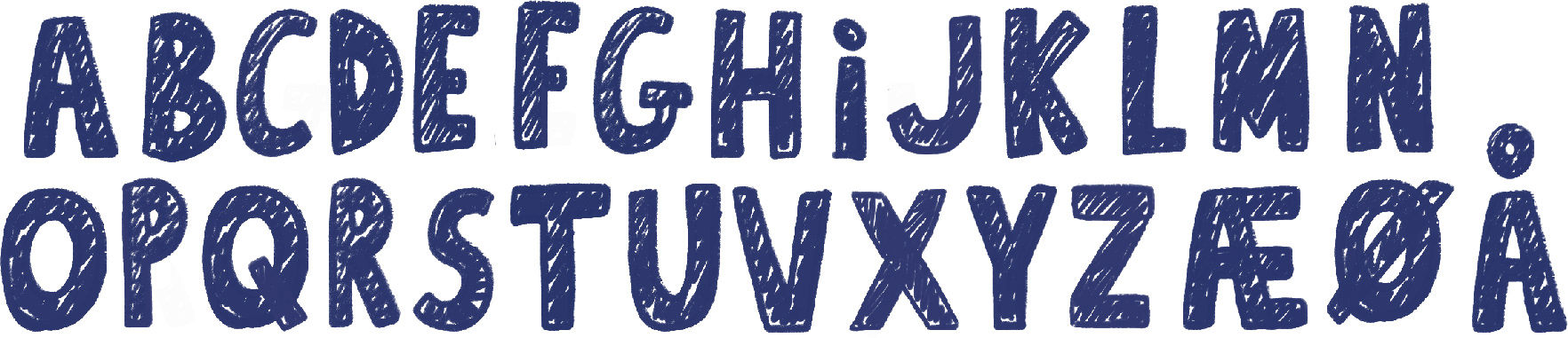
As part of the whole visual identity for the brochure, I created my own typeface functioning as a counterpart to serif typed text in the textboxes. Inspired by the textures, I made a font with a supposed used feel to it.
Final Product